This is the final product that was able to create for Troy's Pack Rat company. The vehicle wrap turned as I wanted. I wanted to use as much of the negative space as possible. Unfortunately I am not competent enough to have figured out how to rotate the vehicle to show a tailgate wrap. This is also present throughout the trailer wrap. I had difficult time saving images to a PNG file in order to upload to the free software program that I used. The second half of the trailer wrap I would of like include some of the services that Pack Rats offer. Such as junk and landscape removal along with moving. The Pack Rats log stands out very well and has a professional feel. As we discussed the house sitting upon the company name creates closure within the image. With more training and experience I would have liked to include some more graphics that would drag the eye across the canvas of the vehicle down to the trailer. Forcing the viewer to see both logos and contact information. Beside the lack of know how, I feel this was an interesting learning experience that will be useful in my future professional career choices. Regardless of profession, visual design knowledge will always be a useful tool. Thanks to every in the group.
Alex Jones COMM3560
Thursday, April 27, 2017
Compose Your Frame
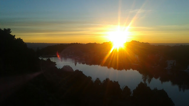
This was an image I captured a few years back while fly-fishing the foot hills of Capital Reef National Park. The area is know as Thousand Lake Mountain and is located North of Loa, Utah. I had just woken up to the sunrise cresting over the horizon. This area has a strange natural pollution like atmosphere that allows for the some of the most significant sunrises I have seen. The sun is almost centered on the horizon line and the shoreline of the lake. There seems to be contrast between the existing darkness of the foreground and the newly risen sun in the horizon. You have the multiple vectors of the image. The Horizon line, tree line, and the body of water. These could also play into the rule of thirds that allow the eye to be drawn to certain points in the image. The diagonal rule is most noticeable within the position of the lake. I was located in the bottom left corner of the lake which positioned the lake at an angle to the horizon line. If you follow the shoreline to the horizon you can faintly interpret some of the red rock formations of Capital Reef.
Tuesday, February 7, 2017
Design Evaluation
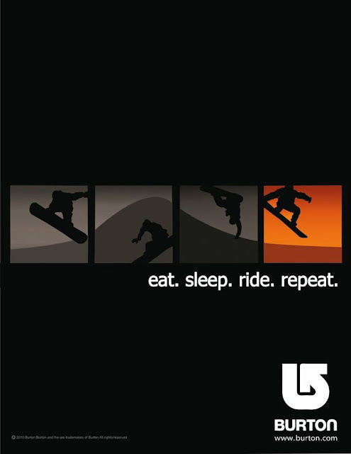
This an advertisement for Burton Snowboards from Transworld Snowboarding magazine. The date of publication was unknown, but appears to be older. This is why I chose to discuss the design. the contrast between the advertisement and the logo are not strong enough to justify the advertisement. The eye is immediately drawn to the dark figure in the middle of the screen. The statement "life isn't about the destination, it's about the ride." I felt this to be a weak and bland statement which reinforces the lack of pop within this images design. Also I did not get a very strong sense of product identity. It seems that this was trying to correlate the identity of this product with a sense of adventure. I would have been more affective to use a more realistic image. Even though this was a weak design, it does provoke a sense of motion with the airborne snowboarder and inspirational quote.
The design of this image creates much more sense of convergence. It is so simple but meshes the product with the activity. The flow of the horizon line throughout the four different sections create a better sense of flow through the image. The contour of the horizon and position of the individual creates an identity that a consumer will correlate with the Burton arrow or a sense of a superior product . Contrast between the negative space and boxes successfully draws the eye to the center of the page. The spectrum of the color gray within the boxes. The creation of motion was more successful within this image. The flow and progression of the individual in the boxes which also correlates with the motto beneath the boxes. The Burton logo is much more visible due to the contrast in color.
Thursday, January 26, 2017
Contrast, Balance, Hamony.
 This is an image of a Lake Powell sunrise. What really grabbed me was the assumption that the photograph was captured at sunset. After researching the origin of the image I was able to discover the time of the photo. Being an avid fly-fisher I began to connect the dots The flat surface of the water is a dead giveaway. It is much harder to find glass like conditions in the evenings versus mornings. This explains why fisherman are known to leave so early in the morning.
As for relating this image to the Gestalt principles, I would like to begin with the Law of Pragnanz. Upon review, I continuously return to the surface of the water. At first glance I just see a calm surface. After surveying the image as a whole, I begin to see the paramount importance of the reflection on the water. If you look at the bottom right hand portion of the image you are able to recognize the silhouettes of rock formations on the surrounding shoreline. Between the formation and reflection an almost perfectly straight line catches the eye. The line almost entirely separates the image into two different panes. One could interpret the line as being associated either as the Law of Continuity or the Law of Closure. Personally, I take the separation as the Law of Closure because it creates the contrast between the surface of the water and the stormy sky. Similarity, the lakes surface contains the diverse spectrum of color reflected and mimics the color of the sky. The differences between the two is texture. The contrasting texture of the sky is linked to the distinct separation of color, where the lake has more of a smooth flow of color. The reflection on the lakes surfaces appears to slowly merge one shade or color into the next.. The last aspect I noticed were the shrubs in the lake. These shrubs almost mimic the land features in the background. Upon final review, I began to see four different perspectives. These are the lake, sky, land, and bush perspective. Each time I reviewed this image my eyes would immediately travel to a different location. This is a part of the reason why I enjoy outdoor photography. A photographer can use the same location and landscape to create so many different perspectives based on time off day, year, or weather conditions
Thursday, January 19, 2017
Visceral Response
This is an image of Horseshoe Bend on the Colorado River. The first characteristic I noticed within this image is the horizon line. The horizon line separates the red rock from the cloudy blue sky. The cloudy sky is somewhat of a negative space because the eye immediately moves to the river and the island. The spectrum of color in the sky is what creates the benefit of using a stormy sky versus a clear blue sky. The time of day this photo was taken adds shadow which influences the perceived depth of the canyon. The blue water correlates with the blue sky and the rust color of the iron in the rock creates beautiful contrast which signifies the beauty of Utah itself. The island creates a centerpiece for the image that allows for the circle shape of the river even though the river continues on. If someone had never seen this image they might assume this is a lake or a pond because the on first appearance the viewer does not see where the river enters and exits. Also, the smooth texture of the river may lead a first time viewer that this is a lake. Also, the cloudy sky complements the ruggedness of the canyon landscape by having a similarly rough texture. Overall, this is a great image that was captured at a precise moment in time that creates these specific characteristics never to be seen again.
Tuesday, January 17, 2017
Background Info
Obviously, my name is Alex Jones. I was born and raised in Utah. The majority of that time was spent in South Jordan, where I would graduate from Bingham High School. Being the youngest of three boys, I spend most of my free time with my brothers or my dad fly-fishing. Also, I enjoy any opportunity to do some snowboarding, though Saint George is not the ideal location. I am a senior Integrated Studies major. Hopefully, I will be graduated after fall semester 2017. I am excited to learn visual communication skills that will translate to greater success within the professional world after graduation.
Subscribe to:
Comments (Atom)


