This an advertisement for Burton Snowboards from Transworld Snowboarding magazine. The date of publication was unknown, but appears to be older. This is why I chose to discuss the design. the contrast between the advertisement and the logo are not strong enough to justify the advertisement. The eye is immediately drawn to the dark figure in the middle of the screen. The statement "life isn't about the destination, it's about the ride." I felt this to be a weak and bland statement which reinforces the lack of pop within this images design. Also I did not get a very strong sense of product identity. It seems that this was trying to correlate the identity of this product with a sense of adventure. I would have been more affective to use a more realistic image. Even though this was a weak design, it does provoke a sense of motion with the airborne snowboarder and inspirational quote.
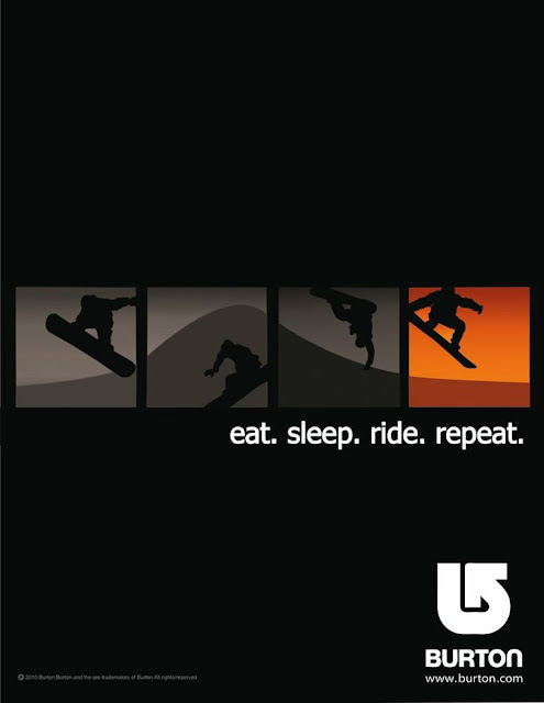
The design of this image creates much more sense of convergence. It is so simple but meshes the product with the activity. The flow of the horizon line throughout the four different sections create a better sense of flow through the image. The contour of the horizon and position of the individual creates an identity that a consumer will correlate with the Burton arrow or a sense of a superior product . Contrast between the negative space and boxes successfully draws the eye to the center of the page. The spectrum of the color gray within the boxes. The creation of motion was more successful within this image. The flow and progression of the individual in the boxes which also correlates with the motto beneath the boxes. The Burton logo is much more visible due to the contrast in color.

